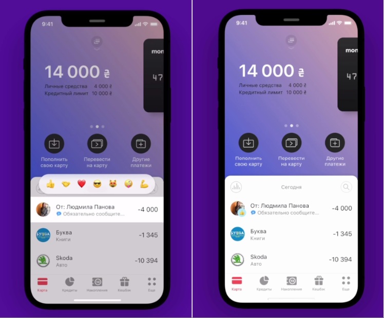
Monobank customers are outraged by the new version of the bank’s mobile application
Monobank users can use the old program interface for some time. The founders of Ukraine’s largest neobank told Forbes about this when commenting on preparations for the redesign.
To put it mildly, not a very good decision

The dissatisfaction of some users did not change the plans. The updated interface will be launched in beta in two to three weeks, said co-founder and CMO Mikhail Rogalsky. According to him, there is no date for a full release.
“For a long time, customers will be able to choose which interface to use,” says Oleg Gorokhovsky, adding that new products and services will be developed mainly for the new monobank 2.0 interface.
Over the six years of its existence, the neobank has acquired a large number of functionalities: several hryvnia and foreign currency cards, a private entrepreneur account, banks for savings, etc.
“The current architecture of the program makes it difficult to develop new products. it was formed when monobank had only one card,” says Mikhail Rogalsky.
More and more new services will appear, and all of them should be logically placed in the new app, Gorokhovsky said.
This time, monobank did not outsource the design development. It was made by an internal team over four months. It took 1,560 hours of development work and 1,120 hours of work by the design team, Gorokhovsky said.
Headache
- For the first time in its six years of existence, Ukrainian Neobank, with 7.7 million customers, is completely redesigning its program.
- The announced update caused conflicting opinions on Gorokhovsky’s Telegram channel with 176,000 subscribers.
- His question, “Who wants a beta with this design this month?” received 10,600 positive responses and 8,500 negative ones.

