WhatsApp updates design for Android and iOS users
Meta starts rolling out WhatsApp updates with a new design to Android and iOS users.
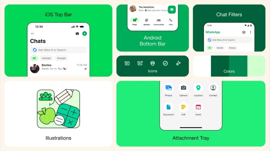
First of all, the company worked with colors. The program will now have a new, consistent green palette for a unified experience.
We updated the icons to a rounded outline style, and to match the new iconography, we also updated the illustrations and added animations for a more playful aesthetic. Standard backgrounds in programs have also been updated.
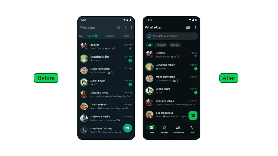
In addition, we took into account the wishes of users to have a darker dark mode and made it more contrasty to reduce eye strain in low light conditions.
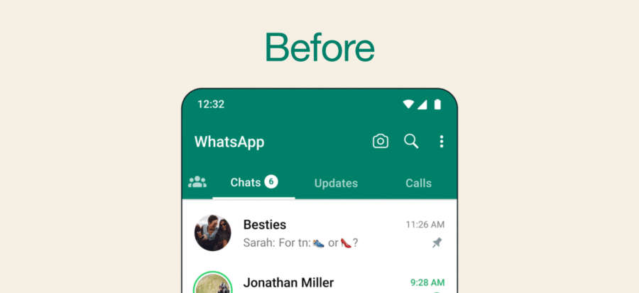
On a more practical note, Meta has updated WhatsApp navigation by moving the buttons in the Android app to the bottom, where they are easier to reach.
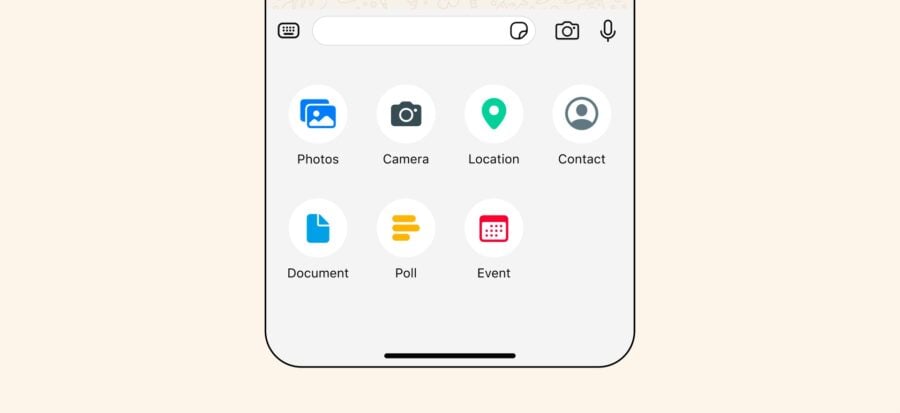
At the same time, iOS has also developed a new interface for attachments that no longer takes up the entire screen.
Moving the navigation to the bottom also allowed the company to add chat filters to the top to make it easier to find unread messages, groups, and dialogs.


