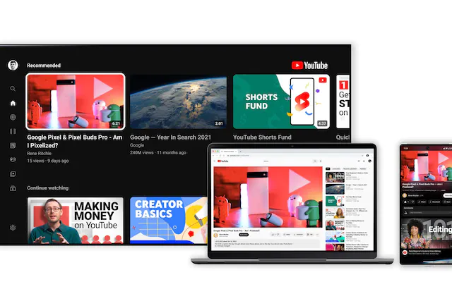
New YouTube design — brighter colors, adaptive background mode, and more convenient search while scrolling
Celebrating its 17th anniversary in 2022, YouTube has decided to update its appearance: the application now has brighter colors and smaller buttons for “Share”, “Like” or “Download”. There are also several new features in the app that will make it easier to watch videos and search while rewinding.
Improved colors and adaptive background mode
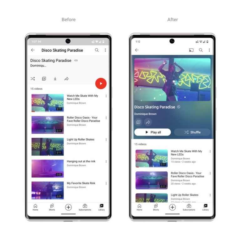
After weeks of testing, YouTube is introducing a new background mode that uses dynamic color sampling: the background adapts to the colors of the video you’re watching. This feature will appear on web and mobile for anyone using the dark theme.
Videos in playlists will have the same adaptive design so that the background does not distract users while watching. More detailed information about each playlist will also be displayed so that viewers can immediately jump to their viewing.

YouTube’s new design features brighter colors, an adaptive background mode, and simplified search while scrolling
“We were inspired by the light emitted by screens in a darkened room, and wanted to reproduce this effect so that viewers are directly involved in the content, and the video draws even more attention to the watch page,” commented on the YouTube blog.
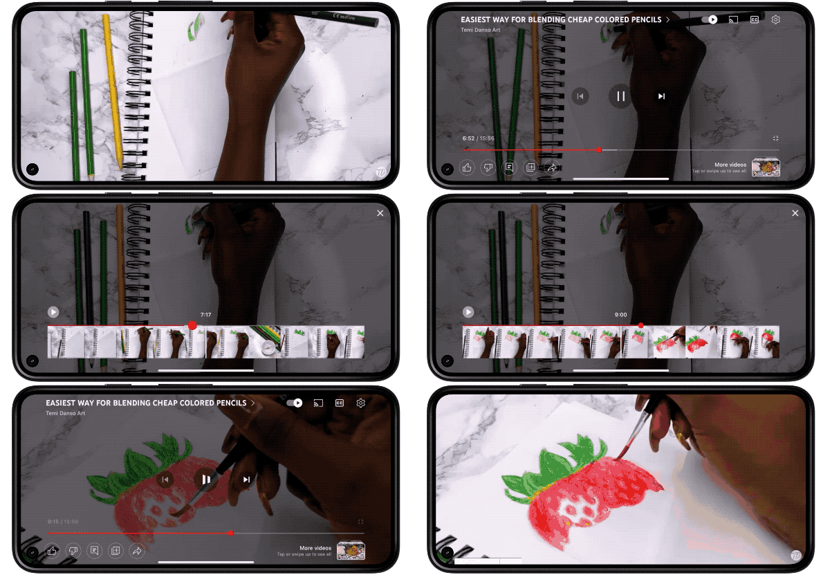
Precise search while rewinding
YouTube’s new design makes it easier to fast forward or rewind to the desired part of the video.
Precision Search is based on YouTube’s recent improvements to video navigation, helping users quickly find the episodes they’re interested in.

Also added the ability to long press anywhere on the player to search and press with two fingers to skip chapters. A separate graph has been created that shows the moments that are often repeated in the video.
Video scaling
YouTube’s new “pinch to zoom” feature lets you zoom in or out on videos on your iOS or Android phone. After adjusting the scale, you do not need to keep your fingers on the screen – the video will continue to play calmly in the size you chose.
YouTube began testing the feature with YouTube Premium subscribers in August. After the update, it will be available to all users.
Updated buttons
The platform has also transformed its “Subscribe” button – the new shape and high contrast make it really noticeable. While the button is no longer red, it’s easier to find and more accessible to everyone on both the watch and feed pages.
The Like, Share, and Download buttons are formatted to “minimize distractions.”
The platform also changed the link in video descriptions to buttons, and video thumbnails have rounded corners. This brings YouTube’s look and feel in line with the Material You design, which is already featured in a number of Google apps, including Gmail, Docs, and Calendar.
Previously, YouTube allowed the use of pseudonyms on the platform – on channel pages and Shorts. This ID can be used for mentions in comments, video descriptions, titles and other elements of the platform. According to YouTube, this will make it easier for creators to reach audiences and increase visibility.

