


YouTube tests new sidebar design, users express dissatisfaction with changes
Although YouTube’s design has been updated over the years, there have been no major changes for a long time. However, the online video service is currently testing a more radical update that shifts many elements to the sidebar. So far, the online reaction to this is not very favorable.
Over the past few days, many YouTube users have noticed a completely new website design. The video description from the video player has moved to the right side of the screen, along with comments. Where it used to be, there are now recommended videos – and there are many more of them.

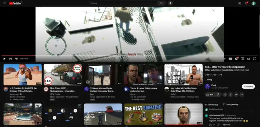
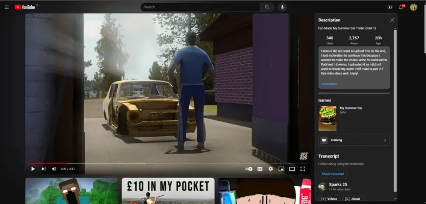
The headline is also impossible to find in the old place, it has moved to the side. Thus, there is almost nothing separating the video being played and the recommendations. Previously, it was the other way around: recommendations were displayed in the sidebar, and the title, description, and comments were placed below the video.
Users generally reacted negatively to the changes. YouTube has even been compared to some other sites with interesting videos. However, there were also more balanced comments:
“I understand that people don’t like changes, especially big ones like this, but isn’t this MUCH better for usability? Now I can read the description and interact with the comments without scrolling through the video.”
YouTube confirmed that this is just a test for now. Of course, it is widely available, but not yet for everyone. Given the feedback, it is likely that this design will not cross the finish line. YouTube users can officially submit feedback on updates on the site.